Case Study
Leah Wrobel Yoga
Freelance /
Web & Graphic Design + Art Direction / 2016 - 2020
Freelance /
Web & Graphic Design + Art Direction / 2016 - 2020
"Working with Kim Nguyen has spoiled me. She is the most thorough, professional, thoughtful, detail-oriented, easy to communicate with, clever, kind (and the list goes on and on), person I have ever worked with. She captured my essence and translated my hard work into a brand that I am very proud of. Kim's ability to create a website, logos, and flyers that are entirely my own, original, and representative, is extraordinary and instantly transformed how new clients and students relate to my business. I cannot recommend her more highly. Anyone would be lucky to work with her."
- LEAH WROBEL
Leah Wrobel is a highly experienced and knowledgeable yoga instructor that guides her students through meaningful mind and body experiences.
Based in Tallahassee, she offers a variety of yoga classes that guide her students to feel stronger, more focused, and relaxed.
In 2016, Leah took her small business to the next level and worked with me to establish her brand identity and website.
In 2019, Leah launched her specialized practice, Wrobel Method Pelvic Health, a proprietary and integrated approach to healthy pelvic floor muscles.
Together, we strategized and updated her website to launch her new practice.
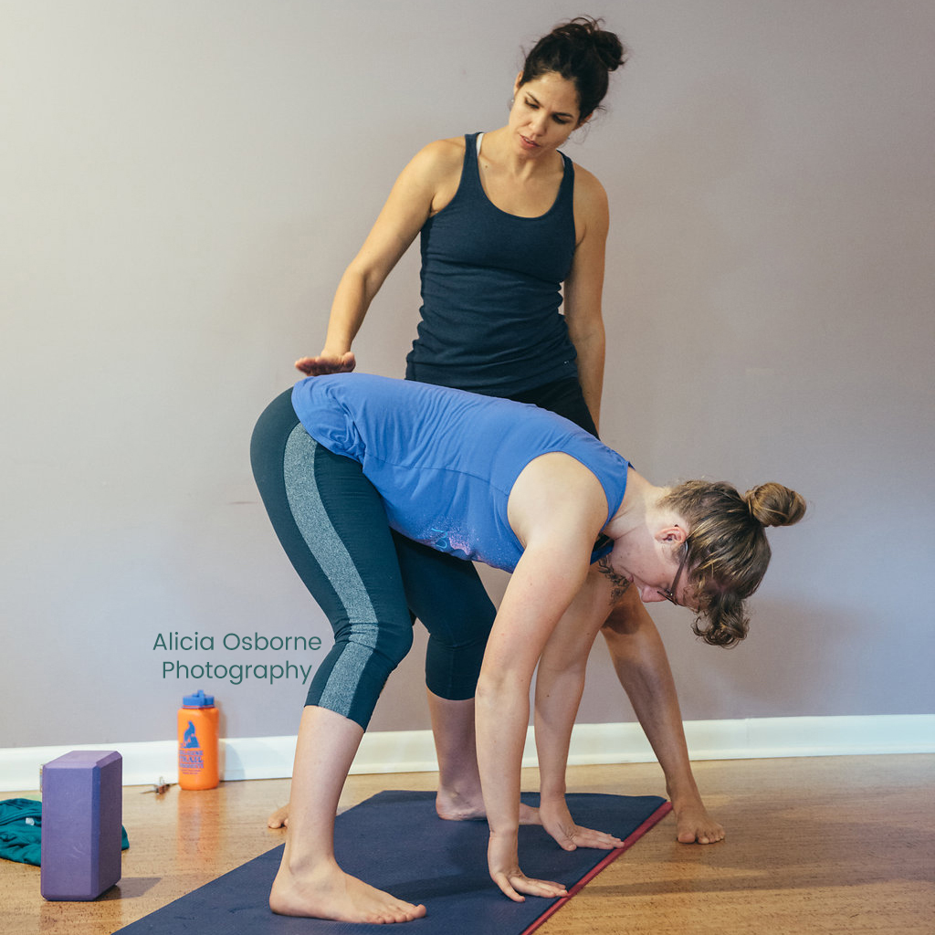
Leah's students are:
Before designing Leah's logo, we had worked together on creating several flyers/postcards for her yoga classes and events. By the time she had decided to embark on this logo journey, we established a color palette and I had a solid understanding of her aesthetic preferences.
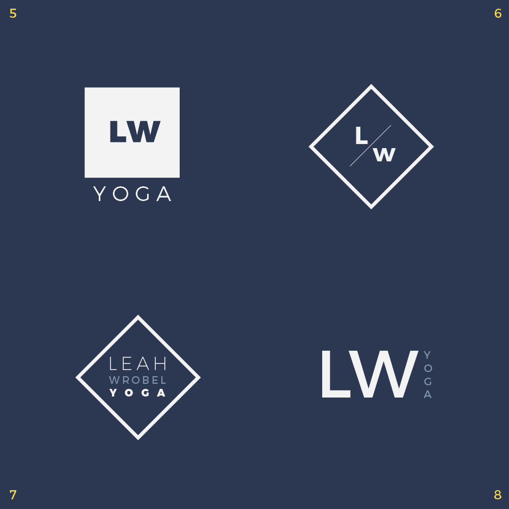
For the first iteration of logos, I created multiple options to see if any of them resonated. Based on our previous work together, I went with a simplistic, geometric, and clean approach (Fig 1). After reviewing, Leah's feedback was that these options were lacking the organic feeling that better suits yoga.
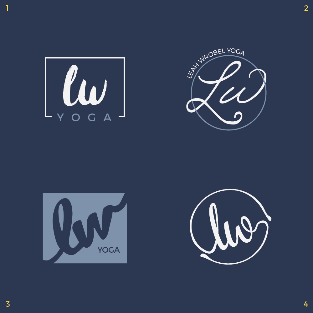
For the second iteration of logos, I incorporated more font faces and shapes with organic and curvy lines. Leah responded particularly to Option 1 in Fig 2, enjoying how the border-box and flowing font mirrored a person on a yoga mat. She wanted to see more options.
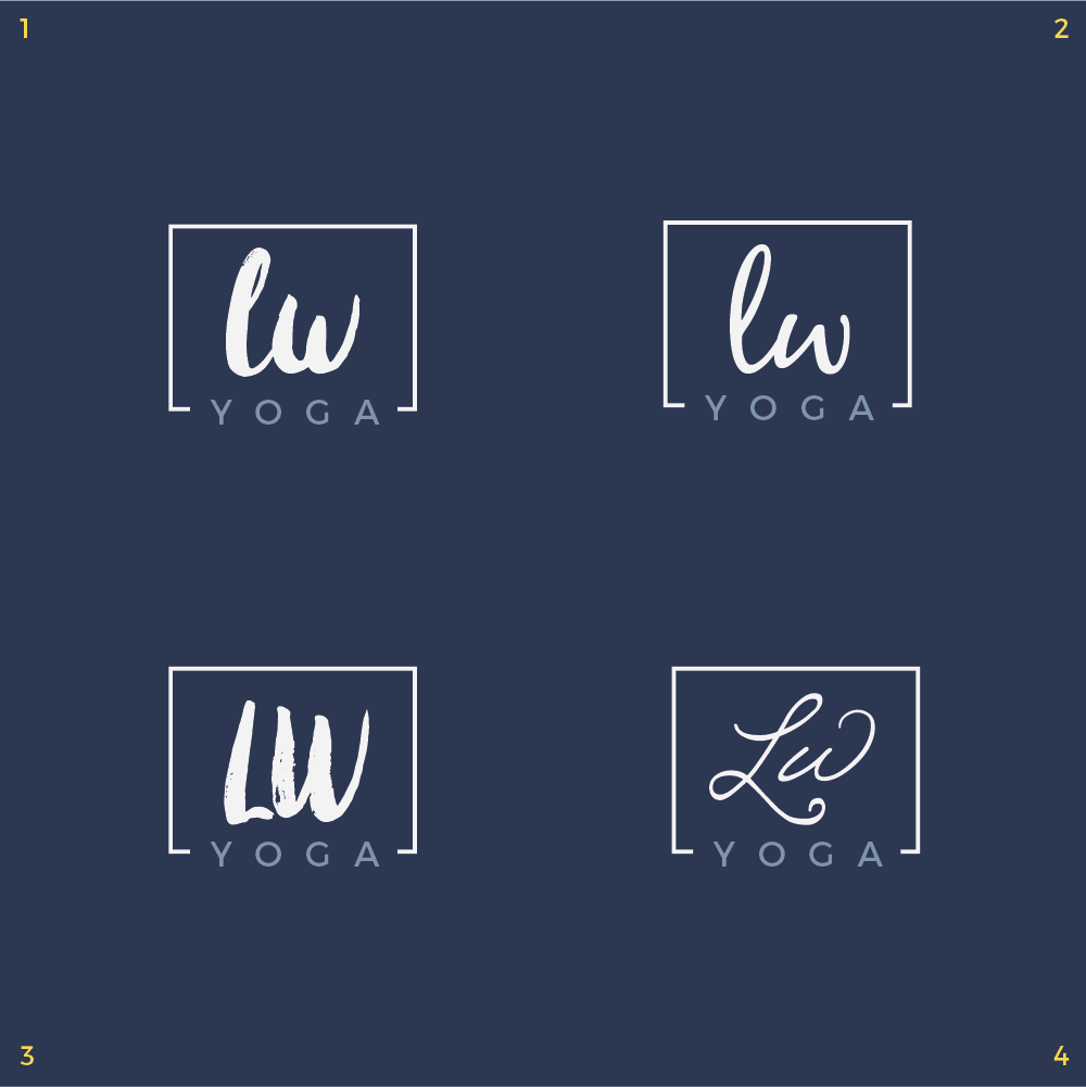
For the third iteration of logos, I created variations of the top pick from the previous round. This time, I tried different organic font treatments. After a few rounds of refining, Leah decided on 1.

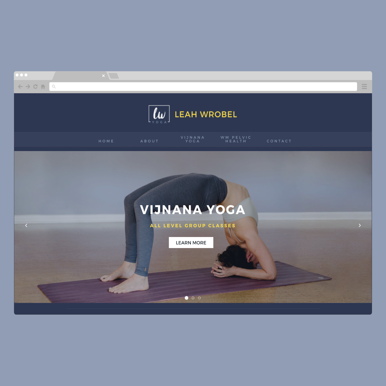
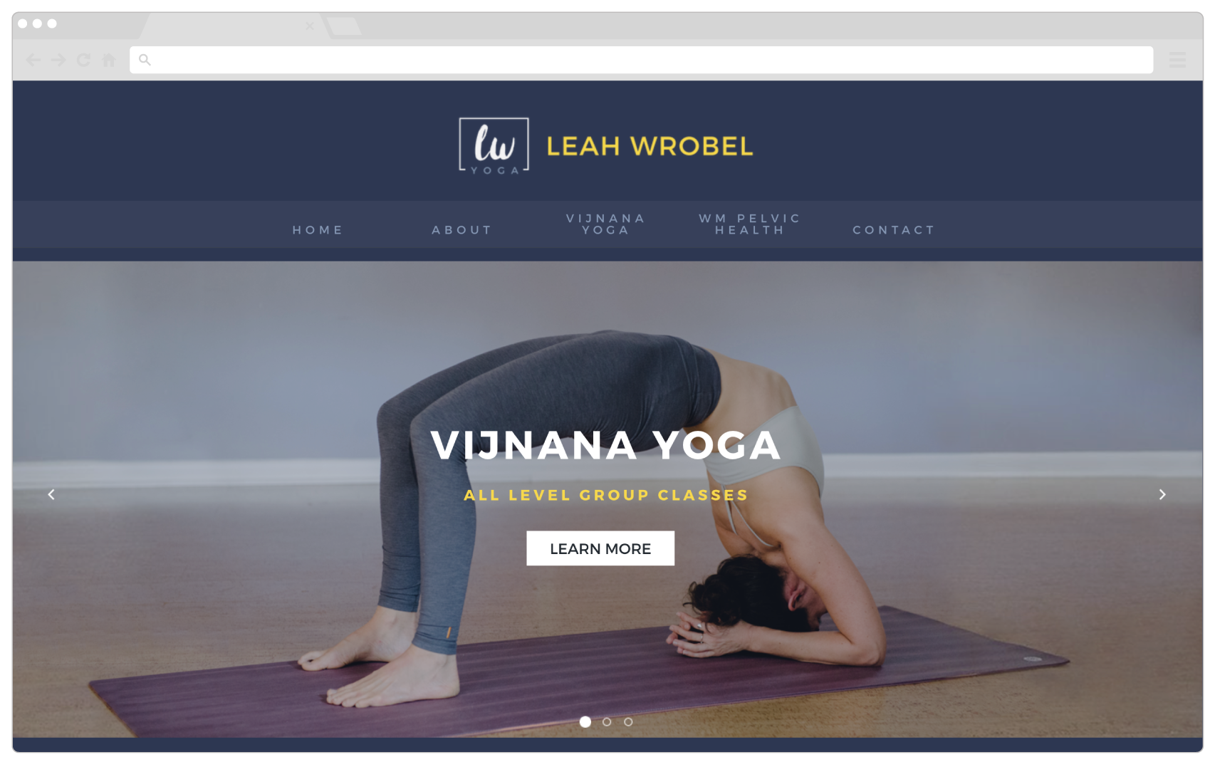
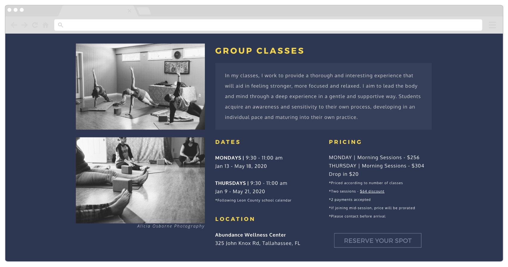
As a major part of the rebranding process, I also redesigned the brand website using Weebly (a popular content management system) by customizing the HTML/CSS code of an existing template.
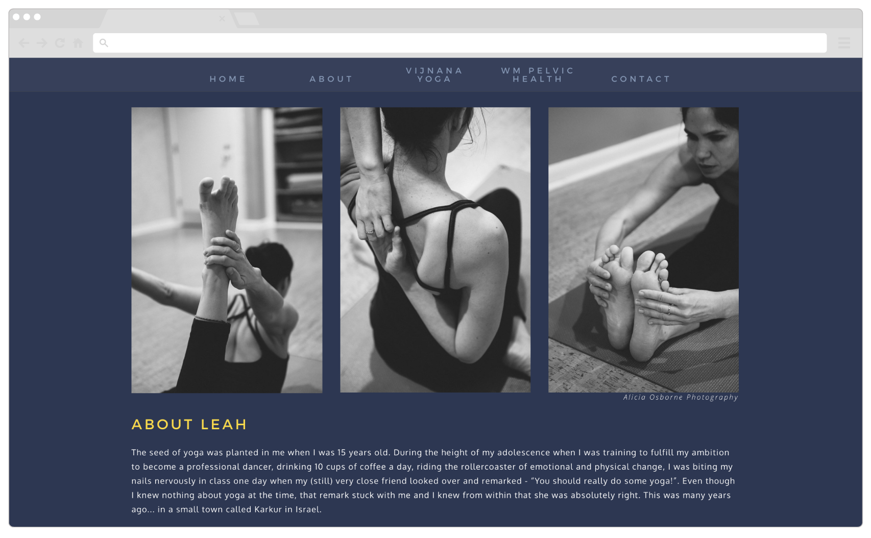
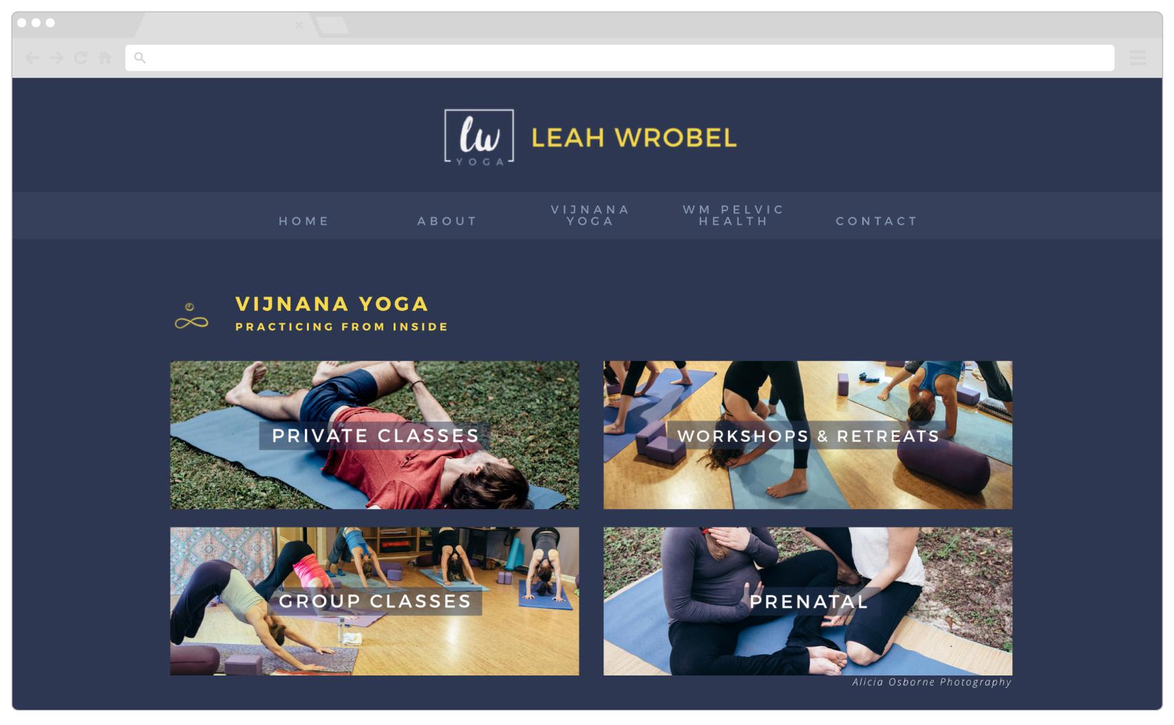
To start, I collaborated with Leah to figure out the structure and content of the site. With her copywriting and my design skills, we tackled each page to complete the site. While designing each page, I used my knowledge of current best practices to ensure the site was easy to navigate and user friendly.
Later on in the process, Leah launched Wrobel Method Pelvic Health. As an extension of her existing brand, we went through the same process above to create a new logo with a matching brand look and feel.

As of 2020, the website has been live for nearly 2 years. As a result of the remodel, Leah has reported: