Case Study
ZALA Hair Extensions
UI Design / 2020

UI Design / 2020

ZALA Hair Extensions is a globally-recognized premium hair extensions brand based in Sydney, Australia.
As a freelancer, I worked directly with the development team to improve select functions on the website. Under the direction of the Chief Technology Officer (CTO), I worked on various projects, like testing modals, simplifying pages, and adding elements to improve the customer experience. I often used Adobe XD and Invision to bring these ideas to life. The following case study is one example of the many.
Based on user data, there was a low completion rate on orders made through the website. Specifically, the data showed that many users were stopping at the checkout page. The CTO suspected that the current checkout page was too cluttered and not easy to navigate, so he wanted to test if a cleaner design would help increase the order completion rate.
Create a simplified and easier-to-use design of the checkout page for the development team to implement and run A/B tests.
While I joined the team primarily as a freelance graphic designer, I was excited to help with any UI design. At the time, I was the sole creative on the team, and handled all creative projects, reporting directly to the CTO and Marketing Director.
Chief Technology Officer: Andrew Moon
Marketing Director: Courtney Best
Freelance Graphic Designer: Kim Nguyen
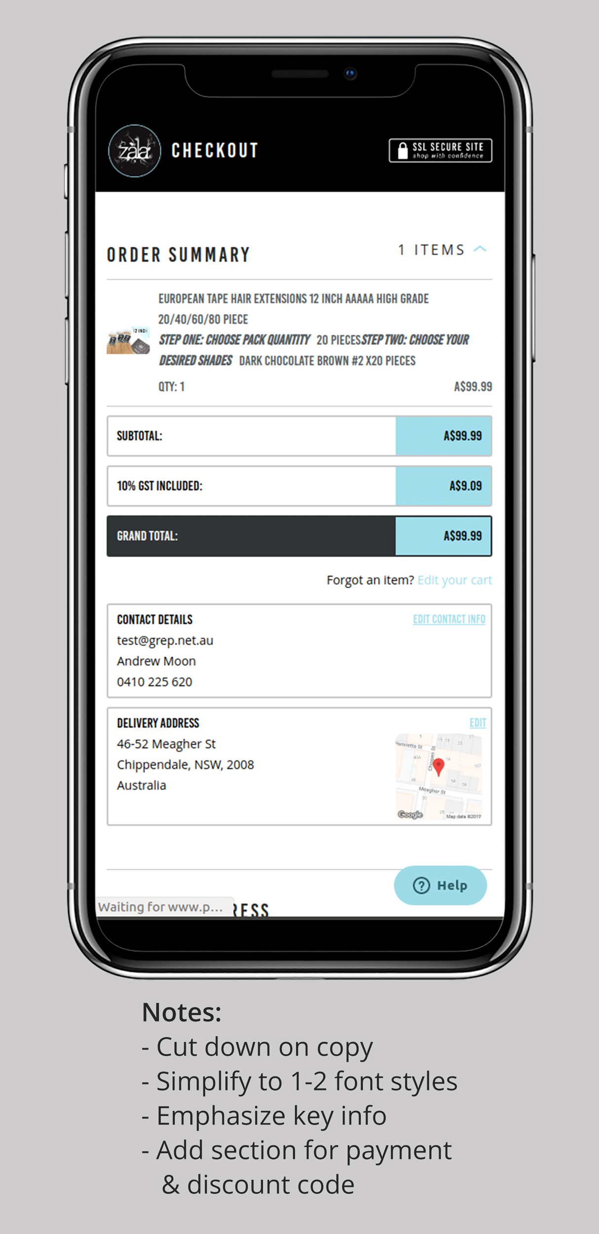
The data showed that most users purchased via mobile, so we focused on mobile-first design. While analyzing the existing design, I thought about things that could be improved, as shown in Fig 1.

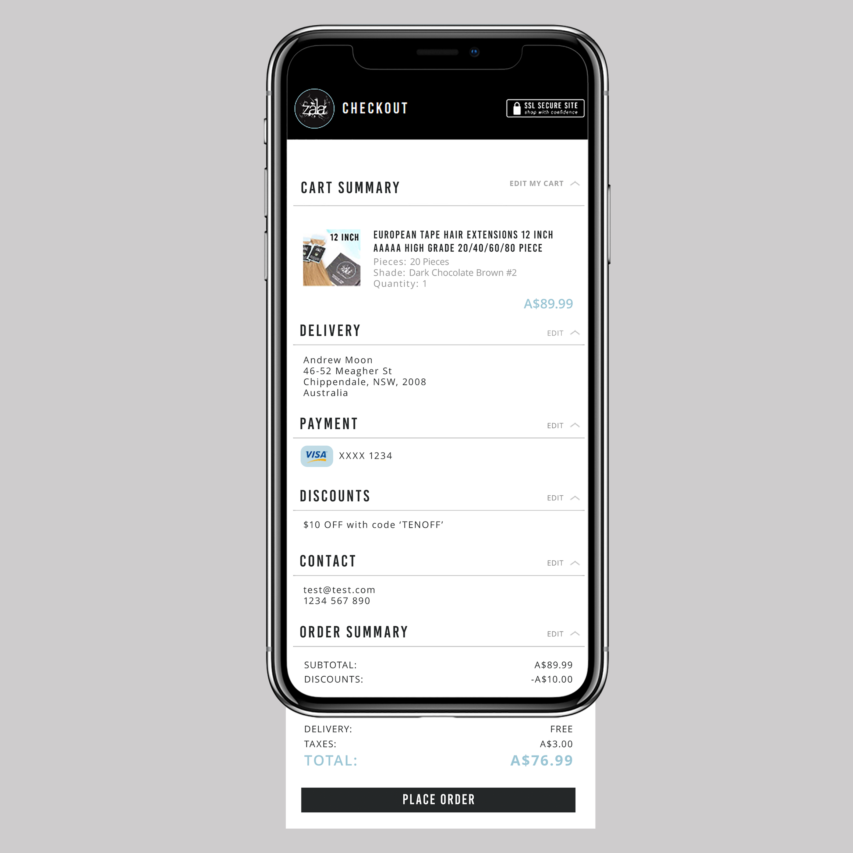
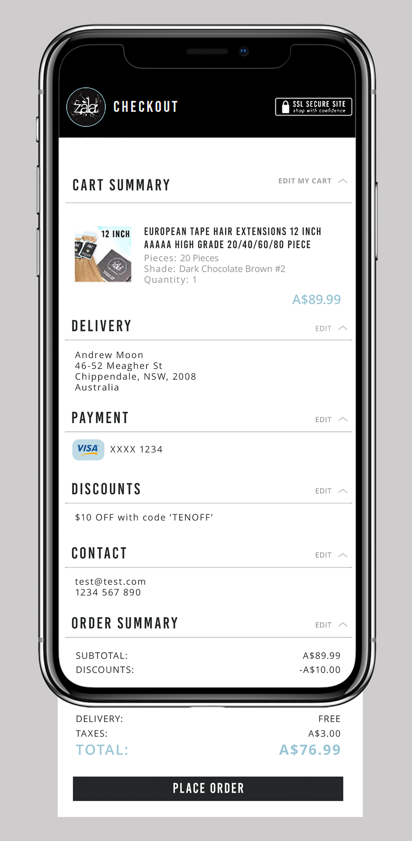
Knowing that these elements needed to be improved, I researched other brands to see how they treated their mobile checkout pages. I then sketched out some ideas, and created the following high-fidelity mock-up:


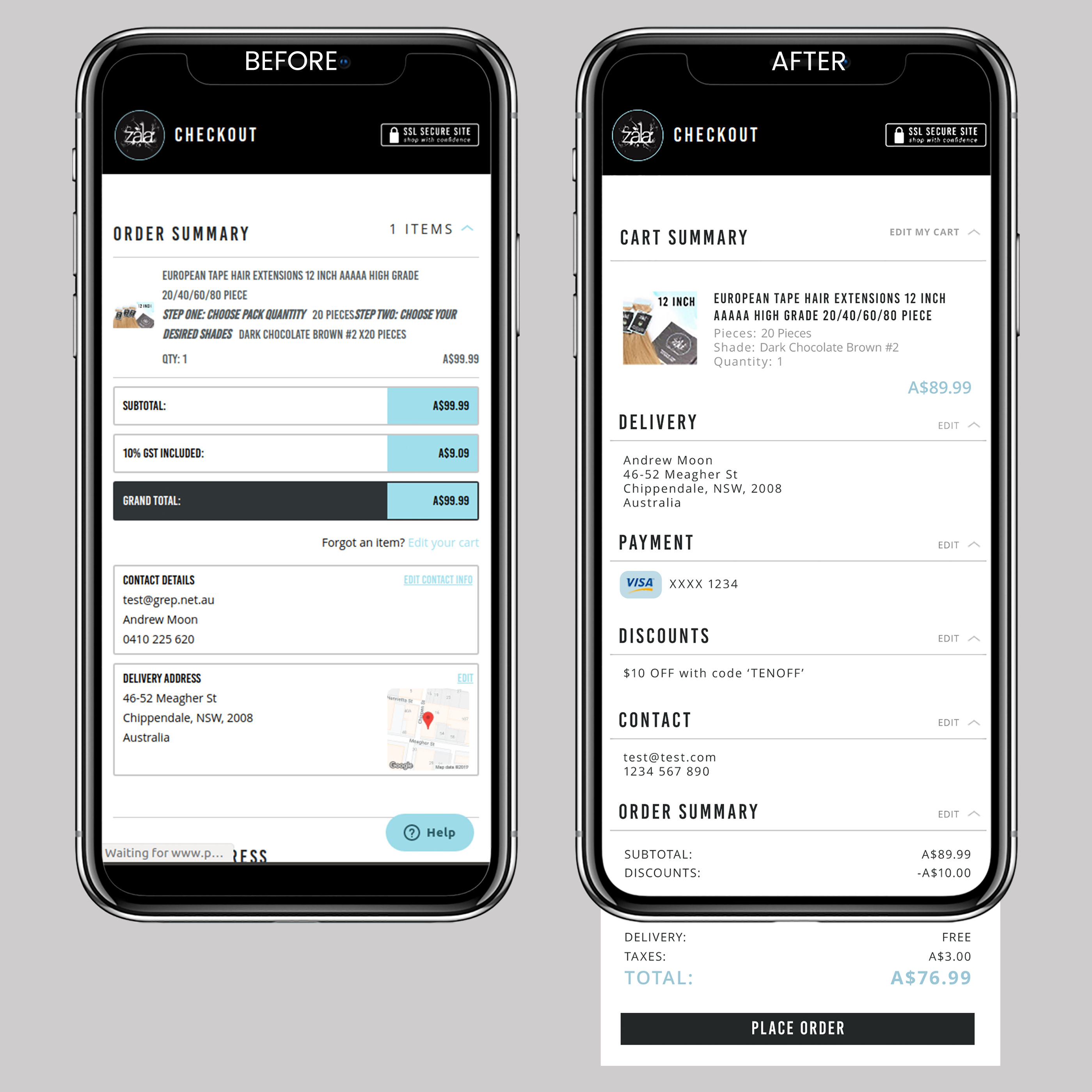
The development team implemented the design in select regions. Currently, the design is still in the A/B testing phase.